Monday, June 4, 2012

Mapping the Station Fire (Week 9)


Campgrounds in LA County at Risk from the 
Station Fire of August/September 2009

 A major fire stormed the Los Angeles County during late August and early September of 2009.  The fire was considered the largest in LA County’s current history and recorded as the tenth largest in the history of California, engulfing over 160,000 acres of land and destroying nearly one hundred homes.  Beginning on August 26, the fire grew rapidly without the help of strong winds, before finally being completely contained on October 16.  The cost of the wildfire is estimated at around $90 million, taking the lives of two firefighters in the process, and is now believed to be a case of arson. 
In accordance to the set of perimeters we have spanning from August 29thto September 2nd, the Station Fire first appeared as a concentrated, circular region stemming out from the San Gabriel Mountains.  The fire initially grew both towards the east and west, before rapidly spreading northwest in a rectangular offshoot with the whole fire shaped like a rough capital “L” early on the 30th of August.  From there, the fire continued to move east, more than doubling in size by the following day on the 31st.  The fire kept burning and moved to the east and west during the first two days of September, turning into a rough sideways oval shape with two branches of fire pushing out further east, until finally looking almost like a lobster claw with the pincers facing east by September 2nd.  
I have included a state map of California with Los Angeles County which is highlighted in yellow and the total affected area by September 2nd in bright red to show the breadth of the fire on a state-wide scale, and give a better idea of where exactly the fire and the county are located.  Next to the state map is a reference map showing the spread of the fire in semi-transparent layers overlaid on top of the hillshade of the region to show how the fire grew in respect to the local topography.  It appears that the fire was contained on the southernmost side by the San Gabriel Mountains, as it could not climb over the tops of the mountains. Instead the fire spread horizontally to the east and west as well as north away from band of mountains.
The thematic map above examines the campgrounds in LA County that were at risk from the Station Fire.  Starting on August 29th, there were only two campgrounds in the fires grasp, the Oakwilde Trail Camp and the Switzer Camp.  On the 30th, twelve more campgrounds were inside the fire’s boundary, and fourteen more on the 31st.  September 1st and 2nd saw ten and eight additional campgrounds within the fire’s range, bringing the total for the five days to 46 campsites at risk.  These campsites would have needed to be evacuated, as most of them were consumed and destroyed by the Station Fire.  The Angeles Crest Highway (part of California State Route 2) is the biggest highway near most of the campsites in question, and would have had to been utilized for evacuation purposes before the road itself was engulfed by the fire. 
The maps I have composed and included in my report provide insight into the location and spread of the Station Fire, as well as its devastating effect on the campsites of the region.  In addition to the possible structural damage sustained by established campsites, the surrounding forests were incinerated and it will be years before the land recovers enough to support camping again.


Bibliography:

CNN. "Investigation under way into cause of Station fire." CNN U.S.. N.p., 1 Sept. 2009. Web. 9 June 2012. <http://articles.cnn.com/2009-09-01/us/california.wildfires_1_angeles-national-forest-fire-officials-fire-chief-mike-dietrich?_s=PM:US>.

InciWeb. "InciWeb the Incident Information System: Station Fire News Release." InciWeb the Incident Information System: Current Incidents. N.p., 27 Sept. 2009. Web. 9 June 2012. <http://inciweb.org/incident/article/9640/>.

InciWeb. "InciWeb the Incident Information System: Station Fire." InciWeb the Incident Information System: Current Incidents. N.p., 10 Nov. 2009. Web. 9 June 2012. <http://inciweb.org/incident/1856/>.

KTLA News. "Report: Number of Firefighters Reduced Before Station Fire."KTLA.com. N.p., 2 Oct. 2009. Web. 9 June 2012. <www.ktla.com/news/landing/ktla-angeles-fire,0,5292469.story>.

LA Times. "Station fire is largest in L.A. County's modern history." Los Angeles Times. N.p., 2 Sept. 2009. Web. 9 June 2012. <http://latimesblogs.latimes.com/lanow/2009/09/station-fire-is-largest-in-la-county-history.html>.

"Station Fire." California Department of Forestry and Fire Protection. N.p., 16 Oct. 2009. Web. 9 June 2012. <cdfdata.fire.ca.gov/incidents/incidents_details_info?incident_id=377>

Monday, May 28, 2012

Census 2000/2010 (Week 8)

Blacks By Country In The Continental US
This choropleth map shown above illustrates the concentration of Blacks in the continental United States, particularly their percentage of the county population according to the 2000 Census. As we can see, counties with high percentages of blacks in their population are mostly located in the Southern U.S., but more specifically, they are located in the states of Georgia, Alabama, Mississippi, and Louisiana. Several counties in those states have the black population making up 47 to 87 percent of the total population. In a nut shell, one only needs to understand the unfortunate institution of slavery in American history to understand this trend. In the West Coast, East Coast, and Midwest, the black population seems to average around 4 to 20 percent of those respective county populations. However, in the Northwest the black population only makes up 0 to 4 percent of the county populations for the most part.

 Asians By Country In The Continental US
This choropleth map shows the concentration of Asians in the continental United States, particularly their percentage of the county population according to the 2000 Census. The asian population is much more dispersed throughout the country than the black population. Concentrations of adjacent counties with high Asian percentages of county population, specifically 7 to 47 percent, are located throughout the West Coast, most notably in California. Note that throughout the continental U.S. there are consistently one or two counties that also have this high density of population. Beginning in their roots in the West Coast until today, Asians seems to have successfully established strong communities throughout the U.S.

"Some Other Race" By Country In The Continental US
This choropleth map shows the concentration of "some other race", in this case Hispanics, in the continental United States. As shown by the previous two, this map shows their percentage of the county population according to the 2000 Census. Similar to the Asian population, Hispanics make up large percentages of county populations in the West Coast in California, specifically 20 to 40 percent. The Hispanics also make up similar large percentages of the Southwest county populations in Arizona, New Mexico, and Texas, where their native country is most nearby. The proximity of this region to Mexico, and the rest of Central and South America clearly explains this phenomenon. It is clear to see that Hispanics have also successfully created strong communities throughout the continental U.S.

This week's lab with emphasis on the census map series made me aware of how complex population analysis can be. It is definitely not as simple as just quantifying each ethnicity as a percentage of the whole United States, because then we would be missing out on most of the valuable spatial data. Only when the data is broken down by sections, such as a county, can we truly see the trends in population growth of each respective ethnicity. It then becomes easy to use the data to assess certain issues and to make the necessary changes to address them. In the bigger picture of utility from these maps, governments can decide where to establish organizations to benefit specific groups of people, and businesses can decide what kind of products to sell and how to advertise in specific areas. This lab, along with the previous labs in this class, have proven to me the invaluable role that GIS has in our world today. Looking at the big picture, powerful spatial analysis is necessary to understand complex social, political, and economic trends, which then enables the necessary policy changes and infrastructure upgrades. My experience with GIS was very straightforward and informative, and I am certain that I will be taking advantage of it in one way or another once I start working as an engineer.

Monday, May 21, 2012

DEMs in ArcGIS (Week 7)

The area I decided to choose is Big Bear Lake in San Bernardino, California. A huge personal fan of skiing, I consider Big Bear the closest and most popular ski resort destination in Southern California. My friends and I come to Big Bear very year and have a lot of experience skiing on its numerous slopes. 

SCALE 1 : 329,899
SPATIAL REFERENCE GCS_North_American_1983
DATUM D_North_American_1983
EXTENT

~top: 34.38 degrees
~left: -117.22 degrees
~right: -116.60 degrees
~bottom: 34.11 degrees


Shaded relief model of Big Bear Lake:
Slop map of Big Bear Lake:
Aspect map of Big Bear Lake:
 
3D image of Big Bear Lake:


Sunday, May 13, 2012

Projections in ArcGIS (Week 6)


The process of converting a spherical model onto a planar mode (while preserving certain spatial characteristics, such as distance, area, or shape) is known as map projection. Typically constructed by projecting from within the sphere, map projection enables the creation and utilization of accurate flat maps. With all of its benefits, it must be noted that there is not one map projection type can accurately translate all the spatial characteristics from the sphere to the plane. As a result, we have different projection types which are conformal, equidistant, and equal area, with each having their own distinct advantages and disadvantages that are used accordingly. All these different types of maps, regardless of their accuracies and inaccuracies, enable the convenient representation of maps on a planar surface, conducive to easy distribution and storage of maps that would not be possible with globes.


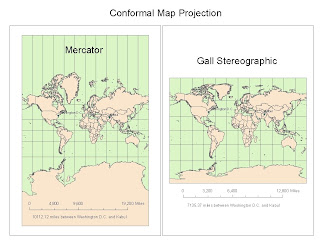
Certain conformal map projections, such as Mercator and Gall stereographic above, are able to preserve both shape and local angles, creating a system of orthogonal latitude and longitude gridlines. Mercator maps in particular represents rhumb lines derived from an initial bearing as straight lines, and stereographic preserves the shape of circles. On the other hand, conformal maps distort areas which are made obvious by the disproportionate size of Antarctica in both the Mercator and Gall stereographic examples. Equidistant map projections, such as cylindrical and conic shown below, represent accurate distances along designated lines and outward from the center. Unfortunately this type of projection significantly distorts area sizes, and does not necessarily show true distances of the points along the center as we can see in the inaccurate distance between the Americas and Australia in the equidistant conic example. Equal area map projections, such cylindrical and sinusoidal shown below, preserve respective areas but also fail to accurately represent latitude-longitude grid angles. Cylindrical, also known as a Gall-Peters projection, only represent true distances along the 45th parallels north and south. On the other hand, sinusoidal represents the area of the Earth as the area between two symmetrically rotated cosine curves. From both, we can clearly see cylindrical and sinusoidal equal area examples that these gridlines are distorted, simply by comparing both to the conformal Mercator example.

For the purpose of this week's lab, we measured the distance between Washington, D.C. and Kabul and we clearly see the distinctions and differences between the various types of map projections. To determine bearing we can look at both the Mercator and Gall Stereographic conformal map projections. We see that the linearity in all directions dictates that traveling southeast in a straight line will conveniently get me from D.C. to Kabul. To determine true distance, we can look at both cylindrical and conic equidistant map projections. We can also see that mapping of longitudes and latitudes illustrates that the true distance between D.C. and Kabul is around 5,065 to 6,941 miles. And as the name alludes, we can accurately assess the areas of the United States and Afghanistan by referring to both cylindrical and sinusoidal equal area projections. I am certain that interchanging any of these map projection types with the data we are seeking will only result in false measurements.


All map projections have both positive and negative outcomes which depend on what information is being sought. Since it is impossible to accurately translate all spatial data from into a sphere and then to a plane, each projection will preserve some characteristics while significantly distorting the rest. As mentioned before, each map projection has its specific and proper use, which is why any spatial analysis can be rendered erroneous if the wrong type of projection is chosen. This is the reason why it is imperative to be aware of how each map projection was created, what its intention is used for, and what spatial data it excels in translating from the three dimensional to the two dimensional domain.


Thursday, May 3, 2012

Learning ArcGIS (Week 4)

My initial experience with ArcMap was made very simple and straightforward by the tutorial that was provided. Parts one and two both took about two hours each of mindless work by simply following the step-by-step directions. Through the process, I was able to combine existing maps with spatial data to output a GIS model of a particular airport expansion project. Many aspects of this program, such as the use of layers and the organization of files, reminded me fondly of other programs such as Photoshop. Before working on this project, I had no idea that there was such powerful and fully-featured modeling software made just for GIS. I can definitely see its value in effectively creating a robust GIS model, while allowing its fast distribution and easy editing if needed.

One of the most important functions of ArcMap is to propose and to answer complicated GIS questions. For this particular lab, the general question that was being addressed was the feasibility of a proposed airport expansion project can be answered by applying various sets of spatial data onto a visual model that anyone can easily understand. For example, the most significant drawback of the project (the increase in the noise level in the area) is represented by a noise contour on the county map. We then overlaid additional layers which contained schools in the area, land use, and population density. This compilation allowed me to determine if the expansion significantly affects any schools, residential zones, or large groups of the county 
population. 

ArcMap has the ability to allow for the addition of all necessary legends and scales to completely show the information. Various tables, graphs, and colors are used to clearly present data. Within the noise contour, there is one school and a significant residential population. Then it would be up to local government officials to compare this GIS data with local laws and regulations to make a decision. As shown, the strength of ArcMap comes in its ability to analyze and organize a lot of spatial data onto a map, while retaining the flexibility to edit and add data on the fly which I must say is very impressive. The program and its presentation is very polished, allowing the use of many of these features to show GIS information, while remaining very stable and fast. It is definitely made with professional maps and large quantities of data in mind.


In retrospect, while I believe that ArcMap's biggest advantage, with its many features and functions, is also one of  its biggest pitfall. Personally, I feel that the menu-based user interface can be very complicated for casual users. The sheer amount of layers that one has to keep track of can get confusing. And the saving system and file extensions are additional details that a user has to keep in mind, thus further complicating things for the user. A casual user simply cannot pick up the program and start using it as a neogeography tool for their daily lives. This makes it necessary for a professional user to take an in-depth tutorial or class in order to take advantage of all its quirks and features, which limits the widespread use of the program to only within the GIS field and related industries.


Tuesday, April 17, 2012

Pebble Beachin' Tour Guide Neogeography (Week 3)


View Pebble Beach Tour in a larger map

Personally, I think neogeography can be a great tool as it allows anyone the ability to share knowledge of places and things that only they might have with the rest of the world through the creation of maps. I think there is huge potential for neogeography for the benefit of all people as it can instantly turn a tourist into a local or make the newly re-located feel right at home. I personally have used neogeography many times to my advantage when visiting places I have never been so that I can get to the local favorites and skip the tourist traps. I think you can get a much better feel for a new place when you follow what the people who live there see and do everyday instead of just going to the standard crowded tourist attractions. Also, through neogeography, people have the ability to show an area without their "visitor" physically being there. This essentially allows anyone to visit a place virtually if they cannot physically be at the location they desire.
There are, however, definitely some pitfalls and negative consequences of neogeography as well. Since literally anyone has the ability and means to make a map and make it public on the internet, the quality is obviously not going to be consistent. Sometimes peoples' opinions can get in the way of true facts as biases and personal experiences will always be a conflicting factor. Bad maps or maps made by people with very little knowledge of the places and attractions they include may lead people in the wrong direction, and thus giving the "visitor" a bad experience. The ease of making a map will make the sheer quantity of maps available so large that it will become increasingly difficult to find the good ones. Essentially, high quality maps will be diluted with poor ones. Also, for locals who prefer to keep their favorite spots secret, one person can make a map and instantly reveal all the places it took them years to find. In this way, I think that neogeography definitely takes away some of the pride involved with getting to know a place intimately by living there and discovering things on your own or through real life interactions. Neogeography so easily available on the internet makes visiting places less personal; instead of asking someone how to get somewhere or for a tip on where to eat, we now go straight for our computers or cell phones and search the internet.

Tuesday, April 10, 2012

Beverly Hill Quadrangle, Understanding Maps (Week 2)


1. What is the name of the quadrangle?

Beverly Hills Quadrangle which is located in California

2. What are the names of the adjacent quadrangles?

Canoga park
Van Nuys
Burbank
Topanga
Hollywood
Venice
Inglewood

3. When was the quadrangle first created?

1966

4. What datum was used to create your map?

The datum used to create the Beverly Hills Quadrangle is the North American Datum of 1927 (horizontal datum) and later updated with the North American Datum of 1983. The other datum used was the National Geodetic Vertical Datum of 1929 (vertical datum).

5. What is the scale of the map?

1 : 24000

6. At the above scale, answer the following:
a) 5 centimeters on the map is equivalent to how many meters on the ground?

1cm = 240 meters -> 5 x 240 = 1200 meters

b) 5 inches on the map is equivalent to how many miles on the ground?

1in. = 2,000 ft. -> 5 x 2,000 = 10,000 ft. -> 10,000ft./5,280ft. = 1.89 Miles

c) one mile on the ground is equivalent to how many inches on the map?

1 mile = 5,280 ft. -> 5,280 ft./2,000ft. = 2.64 inches

d) three kilometers on the ground is equivalent to how many centimeters on the map?

3 kilometers = 3,000 meters -> 3,000/240 meters = 12.5 cm.

7. What is the contour interval on your map?

20 ft.

8. What are the approximate geographic coordinates in both degrees/minutes/seconds and decimal degrees of:
a) the Public Affairs Building:

34*04'30"N = N34.075
118*26'33"W = W118.443

b) the tip of Santa Monica pier:

34*00'30"N = N34.008
118*30'00"W = W118.500

c) the Upper Franklin Canyon Reservoir:

34*06'15"N = N34.104
118*24'41"W = W118.411

9. What is the approximate elevation in both feet and meters of:
a) Greystone Mansion (in Greystong Park)

580ft
176.8m

b)Woodlawn Cemetery

140ft
42.7m

c)Crestwood Hills park

800ft
243.8m

10. What is the UTM zone of the map?

Zone 11

11. What are the UTM coordinates for the lower left corner of your map?

Northing 3763000m and Easting 362000m

12. How many square meters are contained within each cell (square) of the UTM gridlines?

1,000 meters x 1,000 meters = 1,000,000 sq. meters.

13. Obtain elevation measurements, from west to east along the UTM northing 3771000, where the easting of the UTM grid intersect the northing. Create an elevation profile using thse measurements in Excel (hint: create a line chart). Figure out how to label the elevation values to the two measurements on campus. Insert your elevation profile as a graphic in your blog.


14. What is the magnetic declination of the map?

plus 14 degrees

15. In which direction does water flow in the intermittent stream between the 405 freeway and Stone Canyon Reservoir?

The water flows North to South

16. Crop out (i.e. cut and paste) UCLA from the map and include it as a graphic on your blog.